This is the start of a short series about some specifics in the digital lith process that go beyond the descriptions in the tutorial. Here we are going to start with an image and try to get to a digital lith which comes near the look we want (I want). In that process it is much easier to describe the different parameters and how they interact.
Let us start with an image which has some nice gray gradients and also a bit of detail, but not too much. It also has some precious highlight detail which we do not want to loose. First we want to see what happens in those gray gradients regarding lith grain and color.

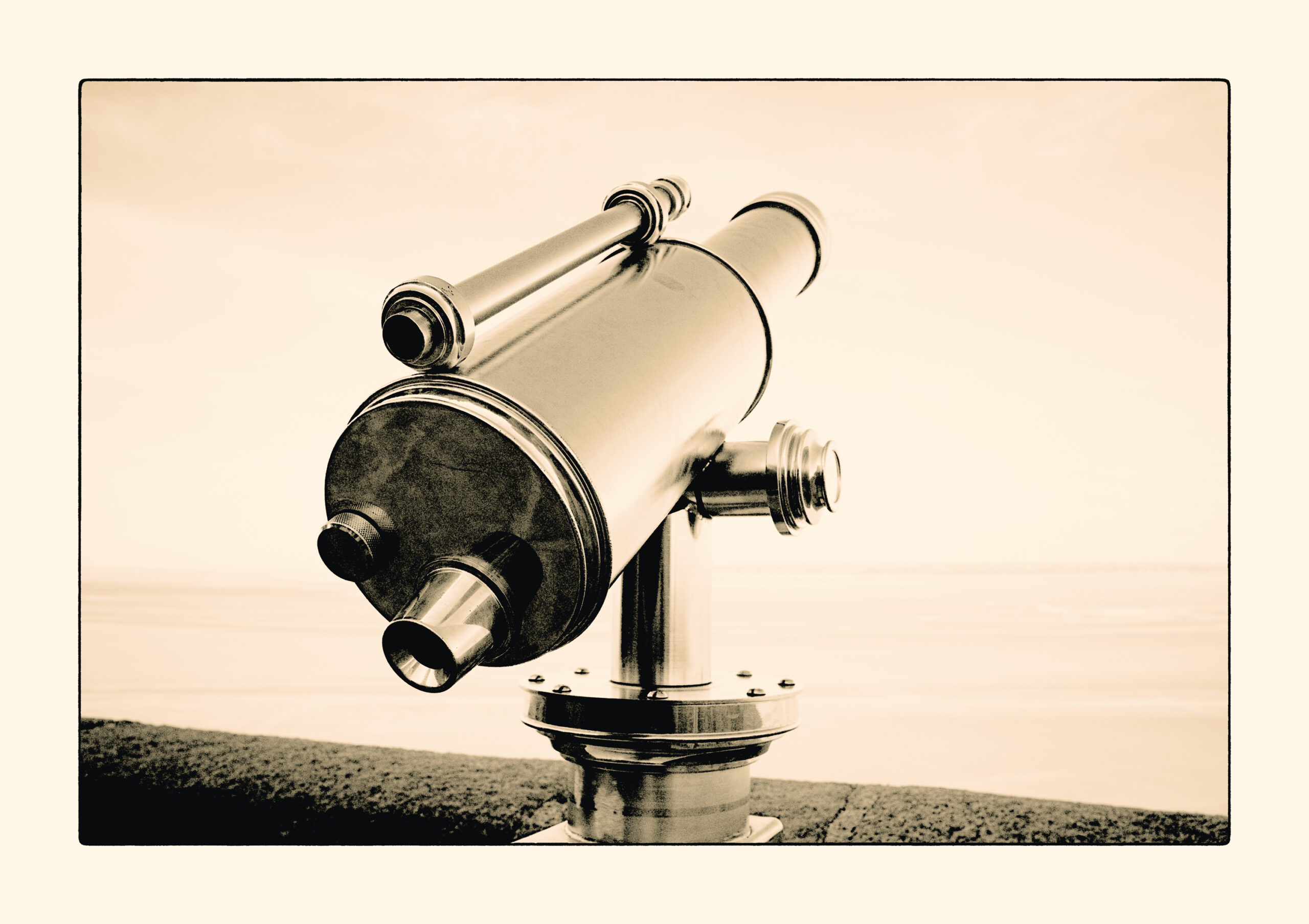
Here is the original image that we start with. I made it available to download in case you want to do your own experiments with it: Click!
One comment: I tend to develop the originals to a point where I regard it as decent black and white image. Only then I send them into DigitalLith as I do not want to maintain two originals, the one that I like in b&w and the one that I treat to be sent to DigitalLith.
When starting DigitalLith load the image and then reset the development parameters. Next to not run in grayscale we need some coloring. If you want to use the same coloring as here in this post you can simply download the coloring preset here: Click! and then import and select it.
Next open the image adjustments parameters and make sure that Scale Image is deselected. Select Image Border and set it to 10. Also select Expose Border and leave the lightness at 100.
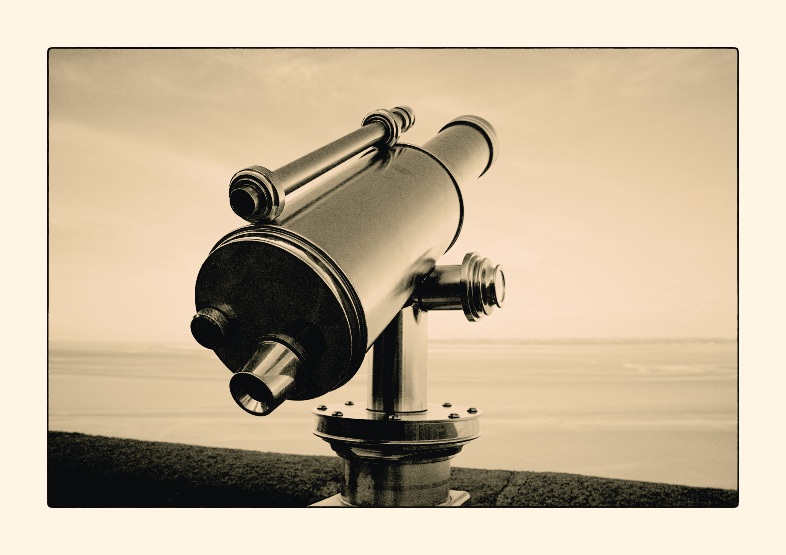
OK, now we are prepared to do a first test development with the default development parameters. What you will get will look like the following:
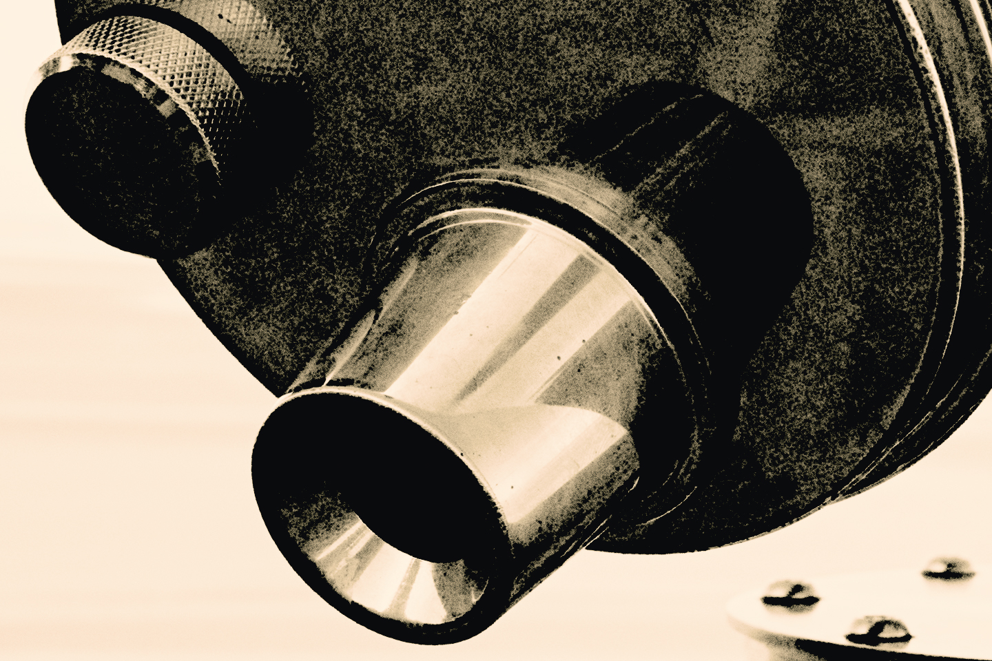
And here two images which show the 100% view (if you click on them)

The first crop image shows the grain development in the gradient from black to white which grainy shadows and smooth highlights. You can also see that the deep shadows already block up a bit. This is very different from programs which have grain simulations where the deep shadows usually lighten up a bit to have the grain visible.
The second crop shows the deep shadows. You see still quite some details, look at the reflection of the knob in the upper left. But there is also a lot of grain being built up and also some nice smooth highlight gradient.
But as you can see in the sky, the highlight contrast is not there yet, there is only a smidge of those clouds seen in the sky. That means we do have to do something about this. And here is how we might address it.
First of all we might develop longer. That will bring out the highlight detail a bit more, but that comes with a price since it will block the shadows. Try yourself, if you develop as long as it takes to see some of those clouds, the shadows go all black. Even with reducing the tray movement, you will not be able to unblock those shadows again. There has to be another way. And right so, if you look at the development parameters there is one called highlight contrast. And it does what it says, it increases the contrast in the highlights. But it also comes at a price, it lowers the highlights. We would have to increase overall contrast a bit to work against that. I come to that in a second. First have a look at the image with highlight contrast set to 2.5 with all else the same as before. I do not show the result here since the shadows will block up heavily. Let us slow down shadow development by exhausting the developer locally by not moving the tray all the time. Let us lower tray movement to 50 and see the result:
So you see clearly, there is a hint of clouds seen in the sky, but the highlights itself are a good amount darker and also the shadows are still a bit more blocked up. Now let us work against this.
There is the Exposure parameter which you also can take if your highlights do not come up with the shadows. It corresponds a bit to the over-exposure needed in the real process and also behaves that way. However instead of giving over-exposure you can also increase overall contrast by using a negative value. Here we give it a try with -2.
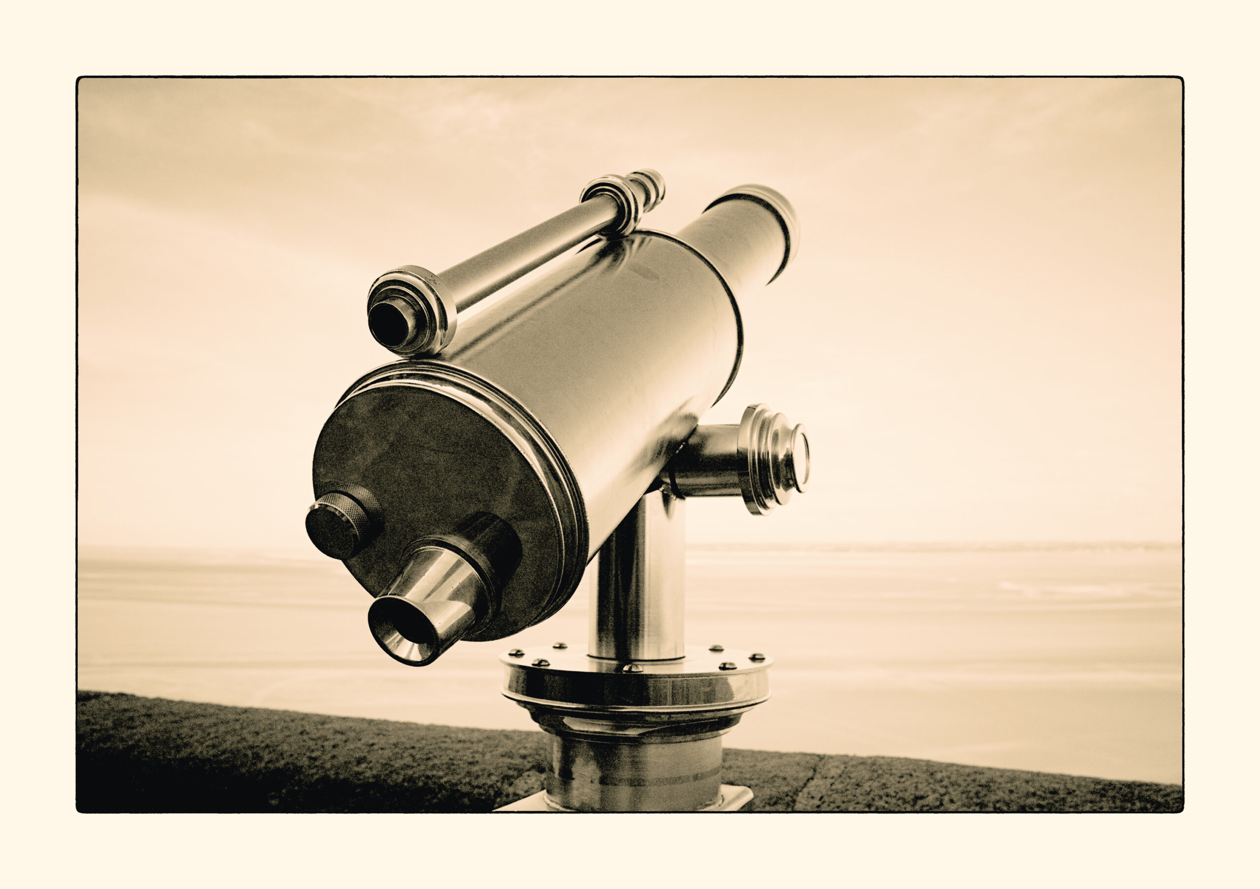
You see, overall contrast is increased, shadows are unblocked again, yet there still is contrast in the very highlights. Compared to the first image you can very well see those clouds. Good so far, now let us go another step with the highlight contrast and exposure and let us go a bit extreme by setting highlight contrast to 5 and exposure to -7. What you will get is something like the following:
Did you realize, until now we kept the development time constant. Sure, it might have been better to adjust the time a bit in the above examples, but we were not yet at the fine tuning stage. At this point I would probably decrease tray movement a bit and increase development time a bit. Here is where I ended up, development time set to 110 and tray movement at 25.
That is it for this first in a series of case studies. We went through the following parameters: highlight contrast, exposure, tray movement and development time. There is many more adjustments which can influence the result. We are going to visit all of them in the coming episodes of this series.